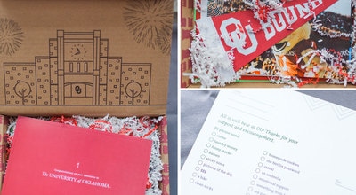
 Image of OU acceptance box Tiffany (guest speaker) worked on. Image from: http://okcaddyawards.com/wp-content/themes/addys-theme/dist/images/peoples-choice-awards/xou-admissions-and-recruitment.jpg.pagespeed.ic.fJ4imtEs8F.jpg Image of OU acceptance box Tiffany (guest speaker) worked on. Image from: http://okcaddyawards.com/wp-content/themes/addys-theme/dist/images/peoples-choice-awards/xou-admissions-and-recruitment.jpg.pagespeed.ic.fJ4imtEs8F.jpg This Tuesday in Croom's class we began to tackle another Adobe application which was Photoshop. I watched some tutorials on Lynda on the basic tools and how-to use Photoshop. Some of the differences between Adobe In Design and Adobe Photoshop threw me off such as how there are layers on the canvas in photoshop but there are no layers in In Design. With any new application comes uneasiness and uncertainty but by the end of class, Photoshop did not seem like such a foreign application to me. On Thursday we had a guest speaker, and her name was Tiffany. She spoke to us about the essential elements to think about when designing projects in Photoshop as well as where her inspirations came from when designing for OU Admissions. Her take on typography and how important leading was when designing something to be printed showed me that little things could make a huge difference in a design's look. Also, I found it interesting how she looked at big corporations such as Stitch Fix for inspiration and not just universities so that OU would stand out and be different from other colleges. Having her come speak was beneficial and helpful because it helped me realize some things I needed to take into account when starting our photoshop design project next week. I am excited to see if I can create pieces that appeal to a particular age group/public and keep all design elements in mind as well within the next few classes to come. 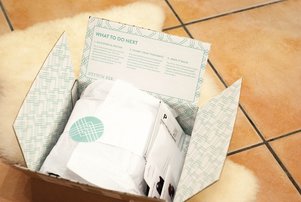 Some of the inspiration for the admissions box pictured above came from this Stitch Fix box. Image from: http://www.thedustyrosestyle.com/wp-content/uploads/2015/01/DSC_0798.jpg
0 Comments
This week in class we were assigned to write 2 media advisories and 2 media pitches. I read the online lectures and formatting about media advisories and media pitches and was ready to jump in. Writing the media advisories wasn't too bad I just struggled some with what information was more important to include than others. When writing the media pitches I found it more difficulty. I had never written really anything like this and I really struggled with keeping my pitches short and but informational. My pitches did go over 150 words but I still believe they were concise and informative. Learning about media advisories and pitches helped me pick up on how to write concisely and how to pick and choose what information was most important to include. I would still like to get more practice on writing advisories and pitches and I think reading Pritch's feedback will also help a lot. I believe learning how to write a media advisory and a media pitch will help me be able to perform my tasks as a PR professional more efficiently and accurately. Learning how to write these will also help me be more qualified and prepared for my future career.
This week in class Pritch assigned us to write 2 news release and do a news release markup. For the news release markup we basically had to mark the elements in a news release of our choosing. Learning the format and elements of a news release this week and the week before helped make this assignment easy to spot out the elements such as boiler plate, dateline, slug and end of story symbol. After completing that assignment I felt better equipped to tackle on the actual writing of a news release. The first news release was harder to write than the second one because it was basic information on an organization not just something specific to cover such as an event. I would still like to learn more about what to include in news releases that is just about a organization/company. All in all I think the news releases went well and I included all key elements into my news releases. Learning how to write a news release will help me be a public relations professional because a news release is an essential and a foundational tool of PR. This skill set will better equip me in my future career by helping my write news release with efficiency and ease.
This week I am interviewing Terry Quinn. A fellow student in my PR Publications class. I will be asking her questions about what our most recent design project (business card and letterhead) was like and her thoughts during this project.
Amanda: Hi, Terry how are you doing today? Terry: Pretty good especially with this warmer weather today. A: I know it is lovely. So, for our most recent design project, a joint business card and letterhead tell me about what organization you chose and why? T: I chose the nonprofit Family Legacy based in the Dallas area. I chose this organization because it is very near and dear to my heart and I go over to Zambia, Africa every summer to do mission work with them. A: Wow, that is amazing. When researching about the Nonprofit what information did you find out about them and their overall theme/ design of the company. T: Family Legacy has a very simplistic clean design. They are an organization that focuses more on what they do and are about then rather having a bold and loud design. A: Very Interesting. When starting to design the business card, what were your initial thoughts? T: My initial thought was wow designing a business card was harder than I thought it'd be. With such a small space you don't want to over design but you still want to keep things interesting. A: I completely agree with you it was much more difficult than anticipated. What were your thoughts on designing the letterhead? T: I think designing on a much bigger canvas is easier and I knew the feel I was going for since it was coinciding with my business card. A: Very true I agree with you. Thanks so much for your time and have a great weekend! T: Thanks! You too! This past week for PR Writing we learned some writing basics. These included the elements of news, the ABCs of Journalism and the two most essential parts of a news release. Learning these skill sets has helped me pick up on what is important to include in a news release and how I should be properly writing for public relations. For example, my writing should always have accuracy, brevity, and clarity (the ABC's of journalism). Keeping these elements in mind will help make my point come across clearly and concisely. Also, knowing how news articles are to be written will help me know what to include in my news releases and wherein the release I should put certain information. Learning about the two essential parts of a news release; the lede and bridge have helped me understand what is expected to be in my writing and why it is important to have these particular elements in a news release. I would like to learn more about what else I should include in my news releases and see some good examples of releases within the weeks to come. Learning this valuable information this past week I believe will help me fulfill the expectations of how to correctly write things when being a public relations professional. I think knowing how to write correctly for the field I'm going in and also knowing what is essential to have in news releases will help me in my future career. Having these skills will enable me to be efficient and knowledgable when I do my future job. 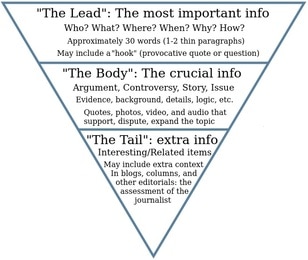 The Inverted Pyramid: Where to include information in a news article; image from: https://canvas.ou.edu/courses/41940/pages/inverted-pyramid?module_item_id=727143 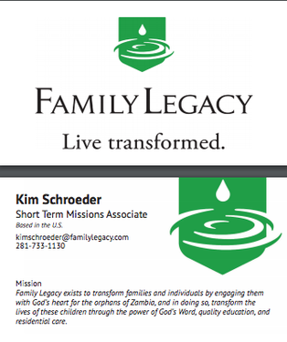 The business card I designed in class. The business card I designed in class. As I mentioned in my blog post from last week this week in class, our assignment was to design a business card. Before class, we had to pick a brand and do some research on it. I chose the nonprofit Family Legacy which helps the orphans of Zambia learn about the Lord and equip them with a quality education. I knew Family Legacy was the brand I wanted my business card to be designed after because I have worked closely with them in the past and I have been personally impacted by this organization as I have mentioned in a previous blog post. Going into class I thought this assignment would be easy but, the whole time I was designing, I felt as though my design was too simple. Every time I would look at other people's computer screens I would see such intricate designs. When I looked at the brand, I was designing for though their logo was so simple and I knew from experience that Family Legacy wouldn't want something over the top. So, I kept the design clean, sleek and simple which is something I believe Family Legacy embodies. I think that was the purpose of the assignment, though, to learn to not over design something in such a small space and know what feel and look the brand you're working for wants. I learned that simplicity in a business card is essential and to only put the most relevant information on a card from this assignment. Along the way, I forgot how to do certain things in InDesign, but with the help of a fellow classmate and Croom I figured it out. I also realized how important it was to keep in mind all the elements of typography l because that can make or break a business card design. I feel proud of what I created, and I am excited to keep improving my skills. I can't wait to see what is in store for next week! 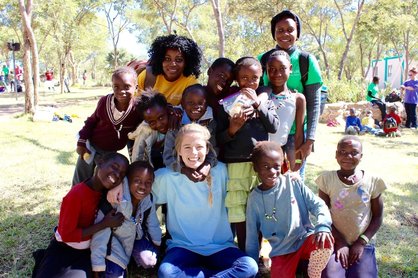 Picture of me with my 10 girls in Zambia at Camp LIFE a Family Legacy ministry. 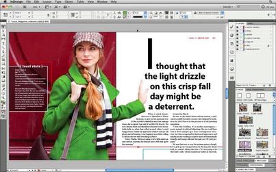 An example of what you can do in Adobe In Design. From: http://getintopc.com/softwares/graphic-design/adobe-indesign-cc-9-2-free-download/ An example of what you can do in Adobe In Design. From: http://getintopc.com/softwares/graphic-design/adobe-indesign-cc-9-2-free-download/ This past week was exciting yet overwhelming at the same time. On Tuesday, Croom told us step by step how to recreate a design using Adobe In Design. We had a crash course in everything Adobe In Design in the span of a single class. Adobe In Design was confusing, to say the least, and the last time I ever used an Adobe Program was middle school. It was a reawakening for sure, but I really enjoyed it. There were so many tools to pick from, and I forgot I had to keep choosing the selector tool after finishing with a particular tool, so I was a little slow at the start. I was a deer in headlights for the majority of the class, but all in all my finished design looked pretty similar to what I was supposed to be mimicking. I left class feeling proud of myself for pushing through but mentally I was exhausted and relieved that was my last class of the day. On Thursday I came back hoping the day would be a little easier. Thankfully, it was and on the agenda for the day was to learn to work with columns in Adobe In Design. Croom showed us on the big screen how columns worked and how to create a layout for a newsletter or something similar to that. Then for the remainder of class, I was supposed to mimic a newsletter design given to me. There was a guide to what type of font to use and what size font but the rest was up to us. Thursday went by much smoother since I had finally begun to grasp how to use the Adobe program. Within 30 minutes my design was coming together and looking like it belonged with the rest of the newsletter. I had a few hiccups with how to properly align everything, but by the end of class, I finally started feeling comfortable with Adobe In Design. Croom instructed us at the end of class with some homework for the upcoming weekend. First, find a brand or company and do some research on it. Second, create a Pinterest board for competitor analysis and then a mood board for the brand/company. This information is going to be used for our first ever solo design project, creating a business card. I am excited to jump in next week on my own and see if I can create a business card worth using! Till next week, Amanda  A photo of me from middle school to help you understand how long ago I used Adobe until this past week. (lol) Writing with Clarity
Poor: The ring was found upon a counter with a diamond missing. Better: The ring with a diamond missing was found upon the counter. Reducing Clutter Poor: Nobody in the entire class knew how to do simple algebra. Better: No one in the class knew how to do algebra. Sentence variety Poor: The teacher was very lonely. She had no friends. Better: Since, the teacher had no friends she was lonely. Sentence emphasis Poor: Rosie Farley spoke to 1,000 students and gave the valedictorian speech at graduation. Better: At graduation, Rosie Farley gave the valedictorian speech. |
Amanda HuseI am a recent graduate from the University of Oklahoma. I majored in Public Relations with a minor in Nonprofit. I am an authentic, philanthropic and proficient person who has technological and communications skills that will help me efficiently communicate with different publics. Archives
March 2018
Categories |
 RSS Feed
